MEST2 Print Research

This BFI magazine doesn't meet all the different magazine cover convention which makes it very unique. The title isn't placed in the top third of the page which most magazines do so that they have room to put a center image. This magazine doesn't have center image which is very typical to most magazines. This means that all the focus of the audience goes into the the title which will lead to them remembering the name and establishing. The colour scheme is very bright with different colours which has a strong contrast will the background. The colour scheme has synergy with BFI as they don't produce mainstream film and are more unique. Below the title, we see the date of release and sponsor which tells the audience when it was released as well as who help produce the magazine.
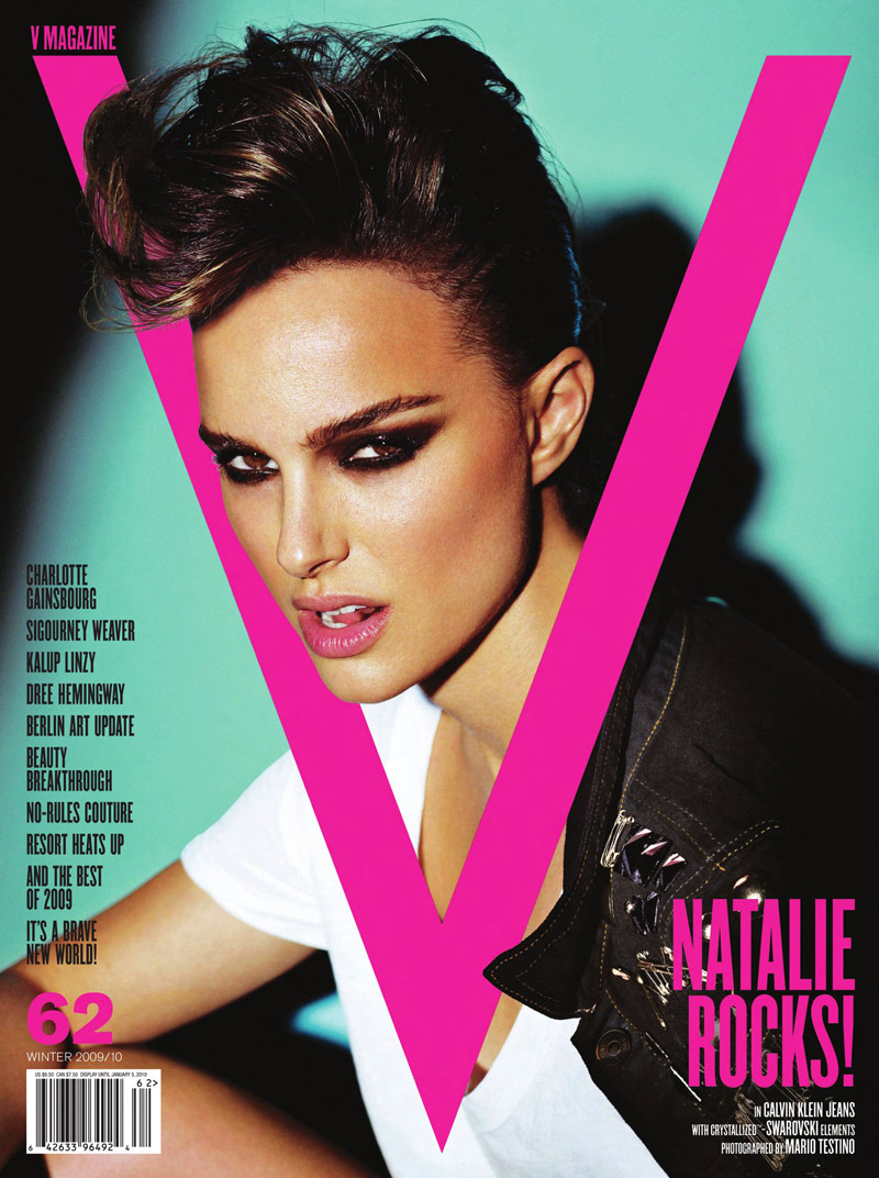
The title of publication is apart of the center image. As the magazine is well known, they audience would know that the "v" would stand for v magazine. I like how the 3 purple titles have a strong contrast and how they stand out. I could use this in my magazine to establish a brand.

I really like how both the villain and hero are put in the same cover. I would use this in my magazine so the audience can figure out the characters and know who is who when watching. I would used low key lighting on the villain to create mystery and tension. I would also include a reference to the movie by have Polish words in the title. In addition, on the bottom right, you can vote for your favorite hero or villain which I could use to interact with the audience.
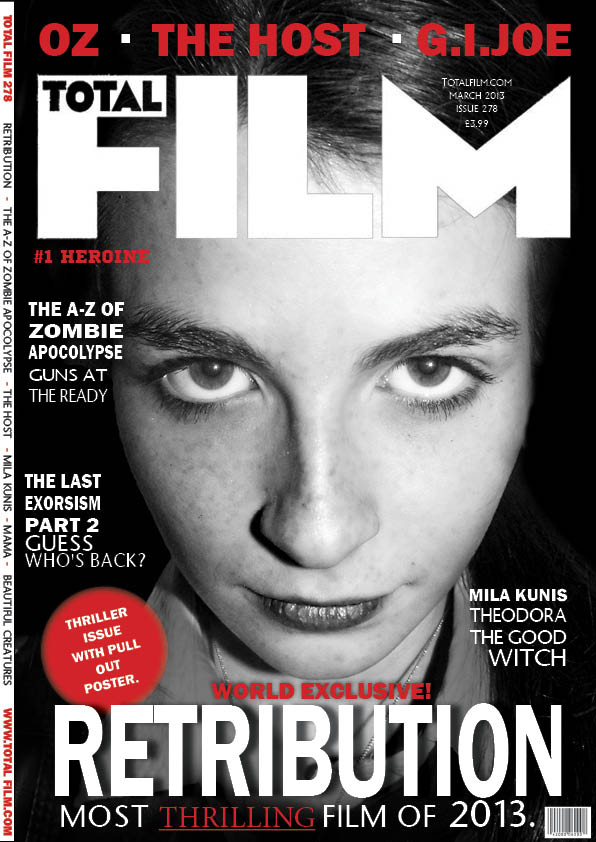
The centre image used is a close up. The facial expression and the colour scheme tells the audience that this is a horror movie. In my magazine, I could use the protagonist face with low key lighting to help create mystery to reinforce the genre. I could also use a dull colour as well as a bright colour to have strong contrast and reinforce the title and the character name.

I like how the background is very simple to make Kanye West stand out and pull the audience attention to him. They have also used didn't fonts which is very different to a typical magazine. I would use the simple background to allow the audience to fores on the centre image and use a very simple colour scheme.
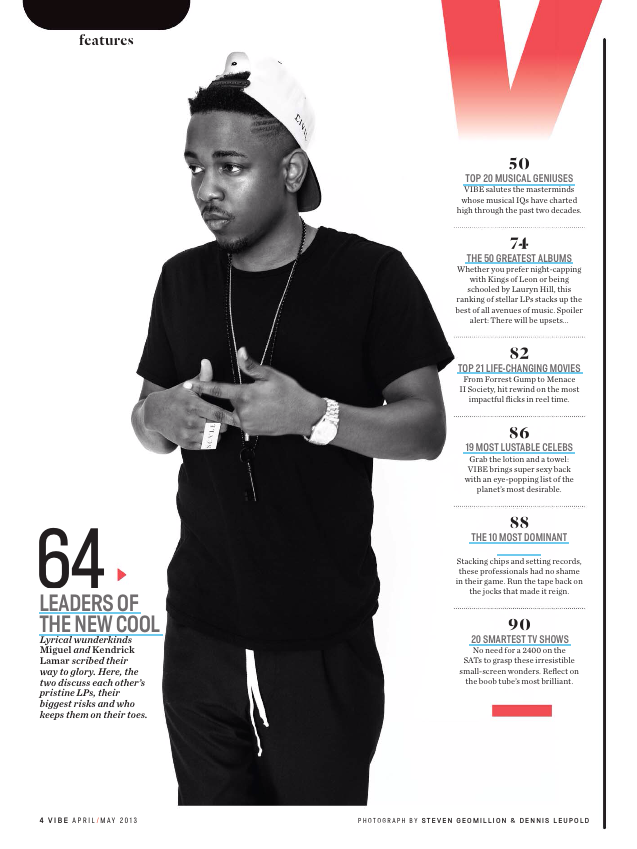
I like the fact that the text is pushed to the side to pull forces to Kendrick Lamer. I would use the black and white effect and have strong contrast with a bright colour so audience know what is important.


Comments
Post a Comment